Actually, while Georgia is a good font overall, the design is Georgia is optimized for the screen. Because of this, it has some peculiarities, such as a very large x-height (so the pixels in the counterforms can be read).
It's not random, they're basically numerals fitting lowercase characters. The idea is to integrate them into text flow. Numerals that are all at the height of upper case would LOOK LIKE THIS IN TEXT ;-)
Not sure about Georgia, but most larger fonts have various versions of numerals for tables (where you want them all the same height, and width monospaced width) and for text (as in Georgia). In OpenType print fonts you can select those types of numbers by turning on/off certain 'features' of the font (the glyphs will be exchanged without changing the text itself). That should be possible soon in webfonts too, I think Firefox already supports that, and IE 10 will follow.
Jeez, I knew someone was going to call me on "random." Each numeral is vertically offset. The offset of each seems to have no rhyme or reason... thus "random" (3,4,5,7,9 are lowered; 6,8 are raised). Apparently, however, it is a common pattern: http://en.wikipedia.org/wiki/Text_figures
> Lots of fonts have numerals that are the same size/location as the rest of the text.
Actually there's not a 'rest of the text' that is homogenous, unless it's completely uppercase. In normal body copy it's a rhythm of ascending and descending letters, and to that those numerals are meant to fit.
The meaning of 'Lining Figures' is numerals that are spaced proportionally (the opposite of their tabular version). They are a good option in technical texts (as those set with LaTeX typically) where you want to integrate numerals, but still have them stand out.
They are also the default numerals in many digital fonts, even if there are the 3 other options as well (it's a 2x2 system of proportional vs monospaced and text numerals vs lining numerals).
> The offset of each seems to have no rhyme or reason
As others point out, those are lowercase numbers, adjusted to look better alongside lowercase text. The rhyme and reason is in how the digits fit within x-height of the font. If you look here: http://en.wikipedia.org/wiki/File:Mediaevalziffern.svg, notice how the dominant "circular" part of each digit fits within the x-height. The digits 3, 5, 7 and 9 don't have a dominant circular part, so their lowest arc is considered a descender, similar to how a 'g' or a 'j' is rendered.
It's more than a common pattern- they are lowercase numerals, even if they don't get used much. Although I see what you meant by random in the sense that lowercase 'g' "randomly" descends while lowercase 'l' randomly ascends.


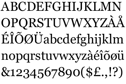

I've thought for years Georgia was a great choice on a resume/paper.
a) You want to stand out
b) You also don't want to appear too "starchy"